Text field
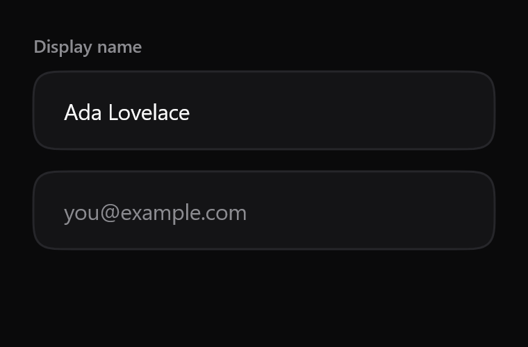
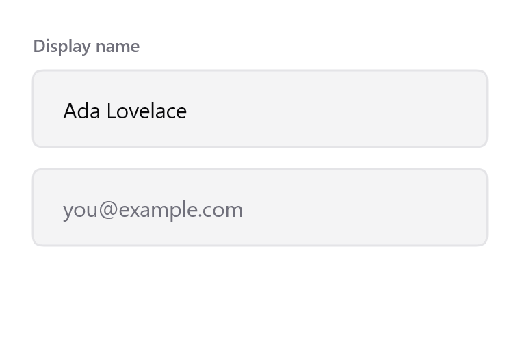
Focus thickens and darkens the field's own contour, on a spring rather than a curve.
$ java -jar lamintra.jar add text-fieldPreview
Rendered headlessly from LamintraTextField.kt. Switch the scheme in the header and this changes with it: both are real renders of the same source rather than one filtered to look like the other.
Parameters
Read out of LamintraTextField.kt when this page was built, not written by hand, so it cannot drift from the file the CLI installs. 2 required, 15 with defaults.
| Name | Type | Default |
|---|---|---|
valuerequired | String | - |
onValueChangerequired | (String) -> Unit | - |
modifier | Modifier | Modifier |
labeloptional text above the field. Rendered exactly as given; this component never transforms your content, because uppercase() here would silently corrupt every non-Latin script | String? | null |
placeholdershown only while value is empty | String? | null |
enabledwhen false the field drops to disabledAlpha and stops accepting input | Boolean | true |
singleLine | Boolean | true |
colorssee LamintraTextFieldColors; defaults to following the system | LamintraTextFieldColors | LamintraTextFieldColors.auto() |
cornerRadiusnull means a capsule (half the height), matching the action silhouette - a field is something you act on | Dp? | null |
minHeight | Dp | 56.dp |
contentPadding | PaddingValues | PaddingValues(horizontal = 22.dp) |
labelSpacing | Dp | 10.dp |
borderWidth | Dp | 1.5.dp |
borderWidthFocused | Dp | 2.dp |
disabledAlpha | Float | 0.3f |
textStylestyle for the entered text and the placeholder. Never sets fontFamily, so the host app's typeface is used | TextStyle | TextStyle( fontSize = 16.sp, lineHeight = 24.sp, letterSpacing = (-0.2).sp ) |
labelTextStyle | TextStyle | TextStyle( fontSize = 13.sp, lineHeight = 20.sp, fontWeight = FontWeight.Medium, letterSpacing = (-0.1).sp ) |
What lands in your project
3 files, written under your own package. The internals are namespaced per component (internal/text_field/), which is what lets two components ship same-named helpers without colliding.
LamintraTextField.ktinternal/text_field/Squircle.ktLamintraTheme.kt
Source
The whole file, verbatim. This is the component: there is nothing behind it, no artifact to depend on, and deleting Lamintra afterwards leaves it compiling.
Read LamintraTextField.kt
package com.lamintra.text_field

import androidx.compose.animation.core.animateDpAsState
import androidx.compose.animation.core.spring
import androidx.compose.foundation.interaction.MutableInteractionSource
import androidx.compose.foundation.interaction.collectIsFocusedAsState
import androidx.compose.foundation.layout.Box
import androidx.compose.foundation.layout.Column
import androidx.compose.foundation.layout.PaddingValues
import androidx.compose.foundation.layout.Spacer
import androidx.compose.foundation.layout.defaultMinSize
import androidx.compose.foundation.layout.fillMaxWidth
import androidx.compose.foundation.layout.height
import androidx.compose.foundation.layout.padding
import androidx.compose.foundation.text.BasicText
import androidx.compose.foundation.text.BasicTextField
import androidx.compose.runtime.Composable
import androidx.compose.runtime.getValue
import androidx.compose.runtime.remember
import androidx.compose.ui.Alignment
import androidx.compose.ui.Modifier
import androidx.compose.ui.draw.drawBehind
import androidx.compose.ui.graphics.Color
import androidx.compose.ui.graphics.SolidColor
import androidx.compose.ui.graphics.drawscope.Stroke
import androidx.compose.ui.graphics.graphicsLayer
import androidx.compose.ui.text.TextStyle
import androidx.compose.ui.text.font.FontWeight
import androidx.compose.ui.unit.Dp
import androidx.compose.ui.unit.dp
import androidx.compose.ui.unit.sp
import com.lamintra.theme.LamintraColors
import com.lamintra.theme.LamintraTheme
import com.lamintra.theme.lamintraDarkColors
import com.lamintra.theme.lamintraLightColors
import com.lamintra.text_field.internal.text_field.Squircle

/**
 * Colours for [LamintraTextField].
 *
 * The three factory names - `dark()`, `light()`, `auto()` - are identical on
 * every Lamintra component on purpose. They are the migration seam: a future
 * shared token layer changes only what `auto()` reads, without touching a
 * single call site. Do not rename them.
 */
data class LamintraTextFieldColors(
    val fill: Color,
    val border: Color,
    val borderFocused: Color,
    val content: Color,
    val placeholder: Color,
    val label: Color,
    val cursor: Color
) {
    companion object {
        /**
         * Maps the shared semantic layer onto this component's own slots.
         *
         * `borderFocused` is `hairlineStrong` rather than `accent`: focus is a
         * state of the keyboard, not of the field, and accent is reserved for
         * component state. See the focus note in LamintraColors.
         */
        fun from(colors: LamintraColors): LamintraTextFieldColors = LamintraTextFieldColors(
            fill = colors.container,
            border = colors.hairline,
            borderFocused = colors.hairlineStrong,
            content = colors.ink,
            placeholder = colors.inkMuted,
            label = colors.inkMuted,
            cursor = colors.ink
        )

        fun dark(): LamintraTextFieldColors = from(lamintraDarkColors())

        fun light(): LamintraTextFieldColors = from(lamintraLightColors())

        /**
         * Follows the device's colour scheme. Reads the *device* setting, not
         * your app's theme - an app that forces its own scheme should pass
         * [dark] or [light] explicitly.
         */
        @Composable
        fun auto(): LamintraTextFieldColors = from(LamintraTheme.colors)
    }
}

/** The system control radius. Same value as the button, deliberately. */
private val RADIUS_MD: Dp = 12.dp

/**
 * A single-line text field, built on `BasicTextField` - not Material's.
 *
 * Focus is carried by the field's own contour thickening and darkening on a
 * spring, rather than by a detached ring bolted outside it. The field is the
 * thing being focused, so the field should be what changes.
 *
 * @param label optional text above the field. Rendered exactly as given; this
 *        component never transforms your content, because `uppercase()` here
 *        would silently corrupt every non-Latin script
 * @param placeholder shown only while [value] is empty
 * @param enabled when false the field drops to [disabledAlpha] and stops
 *        accepting input
 * @param colors see [LamintraTextFieldColors]; defaults to following the system
 * @param cornerRadius `null` means a capsule (half the height), matching the
 *        action silhouette - a field is something you act on
 * @param textStyle style for the entered text and the placeholder. Never sets
 *        `fontFamily`, so the host app's typeface is used
 */
@Composable
fun LamintraTextField(
    value: String,
    onValueChange: (String) -> Unit,
    modifier: Modifier = Modifier,
    label: String? = null,
    placeholder: String? = null,
    enabled: Boolean = true,
    singleLine: Boolean = true,
    colors: LamintraTextFieldColors = LamintraTextFieldColors.auto(),
    cornerRadius: Dp? = null,
    minHeight: Dp = 56.dp,
    contentPadding: PaddingValues = PaddingValues(horizontal = 22.dp),
    labelSpacing: Dp = 10.dp,
    borderWidth: Dp = 1.5.dp,
    borderWidthFocused: Dp = 2.dp,
    disabledAlpha: Float = 0.3f,
    textStyle: TextStyle = TextStyle(
        fontSize = 16.sp,
        lineHeight = 24.sp,
        letterSpacing = (-0.2).sp
    ),
    labelTextStyle: TextStyle = TextStyle(
        fontSize = 13.sp,
        lineHeight = 20.sp,
        fontWeight = FontWeight.Medium,
        letterSpacing = (-0.1).sp
    )
) {
    val interaction = remember { MutableInteractionSource() }
    val focused by interaction.collectIsFocusedAsState()

    val border by animateDpAsState(
        targetValue = if (focused) borderWidthFocused else borderWidth,
        animationSpec = spring(dampingRatio = 0.72f, stiffness = 1400f)
    )

    Column(modifier = modifier) {
        if (label != null) {
            BasicText(text = label, style = labelTextStyle.copy(color = colors.label))
            Spacer(Modifier.height(labelSpacing))
        }

        BasicTextField(
            value = value,
            onValueChange = onValueChange,
            enabled = enabled,
            singleLine = singleLine,
            modifier = Modifier
                .fillMaxWidth()
                .defaultMinSize(minHeight = minHeight)
                .graphicsLayer { alpha = if (enabled) 1f else disabledAlpha }
                .drawBehind {
                    // 12.dp, matching the button. Was height/2, which made a
                    // text field a capsule - Material 3's own filled-field
                    // silhouette, and the shape that made this component read
                    // as Material whatever its colours were.
                    val radius = cornerRadius?.toPx() ?: RADIUS_MD.toPx()
                    val path = Squircle.path(size.width, size.height, radius)
                    drawPath(path, colors.fill)
                    drawPath(
                        path,
                        if (focused) colors.borderFocused else colors.border,
                        style = Stroke(border.toPx())
                    )
                },
            textStyle = textStyle.copy(color = colors.content),
            cursorBrush = SolidColor(colors.cursor),
            interactionSource = interaction,
            decorationBox = { innerTextField ->
                Box(
                    modifier = Modifier.padding(contentPadding),
                    contentAlignment = Alignment.CenterStart
                ) {
                    if (value.isEmpty() && placeholder != null) {
                        BasicText(
                            text = placeholder,
                            style = textStyle.copy(color = colors.placeholder)
                        )
                    }
                    innerTextField()
                }
            }
        )
    }
}
Next
The command above assumes the project has been set up once already. If it has not, the install page covers what init detects and writes, and what to do when it guesses wrong.
The other components: swipe row, sheet, button, card, list row, switch, segmented.