Swipe row
Wraps any row. The actions slide in behind it, and a long swipe arms delete.
$ java -jar lamintra.jar add swipe-rowPreview
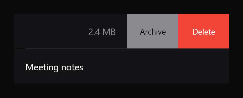
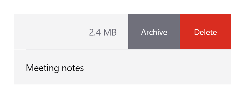
Rendered headlessly from LamintraSwipeRow.kt. Switch the scheme in the header and this changes with it: both are real renders of the same source rather than one filtered to look like the other.
Parameters
Read out of LamintraSwipeRow.kt when this page was built, not written by hand, so it cannot drift from the file the CLI installs. 2 required, 11 with defaults.
| Name | Type | Default |
|---|---|---|
actionsrequiredrevealed right to left. The last one is outermost, and is the one a full swipe commits when it is LamintraSwipeAction.destructive | List<LamintraSwipeAction> | - |
modifier | Modifier | Modifier |
revealedopens or closes the row from outside the gesture. Exists because a list almost always wants at most one row open at a time, which the row itself cannot know: hold the open row's key in the list and pass key == openKey. Changing it animates; the FIRST value is applied without animation, so a row that starts open starts open rather than opening at the reader | Boolean | false |
onRevealedChangereports the settled state after a gesture, so the list's idea of which row is open follows the finger | ((Boolean) -> Unit)? | null |
colorssee LamintraSwipeRowColors; defaults to following the system | LamintraSwipeRowColors | LamintraSwipeRowColors.auto() |
actionWidthwidth of each action cell | Dp | 88.dp |
snapFractionhow far across the revealed width a release must be to settle open rather than closed | Float | 0.5f |
flingVelocityrelease speed that decides the direction regardless of distance, in dp per second | Dp | 350.dp |
fullSwipeFractionhow far across the ROW's own width a swipe must go to arm the destructive action. A fraction of the row rather than of the actions, because it is a deliberately long gesture | Float | 0.62f |
parallaxhow far out the actions start, as a fraction of their width. 0f pins them still under the content | Float | 0.35f |
overshootResistancehow much of a drag past either end is followed | Float | 0.3f |
actionTextStyle | TextStyle | TextStyle( fontSize = 14.sp, lineHeight = 20.sp, letterSpacing = (-0.1).sp ) |
contentrequired | @Composable () -> Unit | - |
What lands in your project
2 files, written under your own package. The internals are namespaced per component (internal/swipe_row/), which is what lets two components ship same-named helpers without colliding.
LamintraSwipeRow.ktLamintraTheme.kt
Source
The whole file, verbatim. This is the component: there is nothing behind it, no artifact to depend on, and deleting Lamintra afterwards leaves it compiling.
Read LamintraSwipeRow.kt
package com.lamintra.swipe_row

import androidx.compose.animation.core.animate
import androidx.compose.animation.core.spring
import androidx.compose.foundation.background
import androidx.compose.foundation.clickable
import androidx.compose.foundation.gestures.Orientation
import androidx.compose.foundation.gestures.draggable
import androidx.compose.foundation.gestures.rememberDraggableState
import androidx.compose.foundation.interaction.MutableInteractionSource
import androidx.compose.foundation.layout.Arrangement
import androidx.compose.foundation.layout.Box
import androidx.compose.foundation.layout.Row
import androidx.compose.foundation.layout.fillMaxHeight
import androidx.compose.foundation.layout.fillMaxWidth
import androidx.compose.foundation.layout.offset
import androidx.compose.foundation.layout.width
import androidx.compose.foundation.text.BasicText
import androidx.compose.runtime.Composable
import androidx.compose.runtime.LaunchedEffect
import androidx.compose.runtime.getValue
import androidx.compose.runtime.mutableFloatStateOf
import androidx.compose.runtime.mutableStateOf
import androidx.compose.runtime.remember
import androidx.compose.runtime.rememberCoroutineScope
import androidx.compose.runtime.setValue
import androidx.compose.ui.Alignment
import androidx.compose.ui.Modifier
import androidx.compose.ui.draw.clipToBounds
import androidx.compose.ui.graphics.Color
import androidx.compose.ui.graphics.graphicsLayer
import androidx.compose.ui.layout.onSizeChanged
import androidx.compose.ui.platform.LocalDensity
import androidx.compose.ui.semantics.CustomAccessibilityAction
import androidx.compose.ui.semantics.customActions
import androidx.compose.ui.semantics.semantics
import androidx.compose.ui.text.TextStyle
import androidx.compose.ui.text.style.TextAlign
import androidx.compose.ui.unit.Dp
import androidx.compose.ui.unit.IntOffset
import androidx.compose.ui.unit.dp
import androidx.compose.ui.unit.sp
import com.lamintra.theme.LamintraColors
import com.lamintra.theme.LamintraTheme
import com.lamintra.theme.lamintraDarkColors
import com.lamintra.theme.lamintraLightColors
import kotlinx.coroutines.launch
import kotlin.math.roundToInt

/**
 * One action revealed by swiping a row.
 *
 * [destructive] is not styling sugar. It picks the danger colours, and it marks
 * which action a full swipe commits to - a full swipe is a shortcut for the
 * thing the gesture is usually FOR, and shortcutting a non-destructive action
 * while a destructive one sits beside it is how a list loses data quietly.
 */
data class LamintraSwipeAction(
    val label: String,
    val onClick: () -> Unit,
    val destructive: Boolean = false
)

/**
 * Colours for [LamintraSwipeRow].
 *
 * The three factory names - `dark()`, `light()`, `auto()` - are identical on
 * every Lamintra component on purpose. Do not rename them.
 */
data class LamintraSwipeRowColors(
    /**
     * Painted behind the sliding content.
     *
     * Not optional and not decorative: the actions sit UNDER the content, so a
     * transparent slider shows them through the row at rest and the component
     * reads as broken before it is ever touched. It matches the container the
     * row is expected to live in.
     */
    val surface: Color,
    val actionBackground: Color,
    val actionContent: Color,
    val dangerBackground: Color,
    val dangerContent: Color
) {
    companion object {
        /**
         * `inkMuted` as a FILL, which is the one mapping here worth explaining.
         *
         * The obvious choice was `containerSunk`, and it is wrong: on the light
         * scheme `container` and `containerSunk` are both `Neutral100`, so a
         * non-destructive action was painted in exactly the colour of the row
         * sliding over it and disappeared. It was invisible in the render and
         * would have been invisible in every light-themed app.
         *
         * A swipe action is not a recessed surface, it is a filled control that
         * happens to live behind one, so it needs a colour with contrast rather
         * than a colour with depth. `inkMuted` is the mid-neutral both schemes
         * already carry - the same grey iOS fills Archive with - and `onInk`
         * rides it at 5.7:1 on dark and 4.8:1 on light.
         *
         * A sixteenth token would have been the alternative, and the theme says
         * a sixteenth needs an argument. This did not have one: nothing about
         * this fill is unavailable from the fifteen.
         */
        fun from(colors: LamintraColors): LamintraSwipeRowColors = LamintraSwipeRowColors(
            surface = colors.container,
            actionBackground = colors.inkMuted,
            actionContent = colors.onInk,
            dangerBackground = colors.danger,
            dangerContent = colors.onDanger
        )

        fun dark(): LamintraSwipeRowColors = from(lamintraDarkColors())

        fun light(): LamintraSwipeRowColors = from(lamintraLightColors())

        /**
         * Follows the device's colour scheme. Reads the *device* setting, not
         * your app's theme - an app that forces its own scheme should pass
         * [dark] or [light] explicitly.
         */
        @Composable
        fun auto(): LamintraSwipeRowColors = from(LamintraTheme.colors)
    }
}

/**
 * A row that reveals actions when swiped left, wrapping any content.
 *
 * It takes [content] rather than being a row itself, so the thing that slides
 * can be a list row, a card, or anything else. Two components composed beats a
 * second row implementation that has to be kept in step with the first.
 *
 * **Four details separate this from a row that translates with a finger**, and
 * every one of them is about the gesture reading as physical:
 *
 * 1. **The snap is a spring seeded with the release velocity**, so letting go
 *    continues at the speed your thumb left at. A tween restarts from zero and
 *    a fast flick visibly hesitates before completing.
 * 2. **The actions parallax.** They sit still under the content in the naive
 *    version, which makes the row look like a lid sliding off a drawer. Here
 *    they start [parallax] of the way out and catch up as you drag, so they
 *    read as arriving rather than as having been there all along.
 * 3. **Both ends resist instead of stopping.** Dragging right past closed, or
 *    left past open with full swipe off, follows at [overshootResistance].
 * 4. **A long swipe arms the destructive action**, which then fills the whole
 *    revealed strip and commits on release. Distance is the signal, so the
 *    common case - delete - needs one gesture rather than a swipe and a tap.
 *
 * **The gesture is not the only way in.** Swipe actions are invisible to a
 * screen reader and unreachable by keyboard, so every action is also published
 * as a semantics custom action. A component whose only affordance is a gesture
 * is a component some people cannot use at all.
 *
 * **This does not remove anything.** It calls [LamintraSwipeAction.onClick] and
 * springs closed; the list owns its own contents. Remove the item in response
 * and the row is gone before the spring finishes, which is the intended look.
 *
 * @param actions revealed right to left. The last one is outermost, and is the
 *        one a full swipe commits when it is [LamintraSwipeAction.destructive]
 * @param revealed opens or closes the row from outside the gesture. Exists
 *        because a list almost always wants at most one row open at a time,
 *        which the row itself cannot know: hold the open row's key in the list
 *        and pass `key == openKey`. Changing it animates; the FIRST value is
 *        applied without animation, so a row that starts open starts open
 *        rather than opening at the reader
 * @param onRevealedChange reports the settled state after a gesture, so the
 *        list's idea of which row is open follows the finger
 * @param colors see [LamintraSwipeRowColors]; defaults to following the system
 * @param actionWidth width of each action cell
 * @param snapFraction how far across the revealed width a release must be to
 *        settle open rather than closed
 * @param flingVelocity release speed that decides the direction regardless of
 *        distance, in dp per second
 * @param fullSwipeFraction how far across the ROW's own width a swipe must go
 *        to arm the destructive action. A fraction of the row rather than of
 *        the actions, because it is a deliberately long gesture
 * @param parallax how far out the actions start, as a fraction of their width.
 *        0f pins them still under the content
 * @param overshootResistance how much of a drag past either end is followed
 */
@Composable
fun LamintraSwipeRow(
    actions: List<LamintraSwipeAction>,
    modifier: Modifier = Modifier,
    revealed: Boolean = false,
    onRevealedChange: ((Boolean) -> Unit)? = null,
    colors: LamintraSwipeRowColors = LamintraSwipeRowColors.auto(),
    actionWidth: Dp = 88.dp,
    snapFraction: Float = 0.5f,
    flingVelocity: Dp = 350.dp,
    fullSwipeFraction: Float = 0.62f,
    parallax: Float = 0.35f,
    overshootResistance: Float = 0.3f,
    actionTextStyle: TextStyle = TextStyle(
        fontSize = 14.sp,
        lineHeight = 20.sp,
        letterSpacing = (-0.1).sp
    ),
    content: @Composable () -> Unit
) {
    val density = LocalDensity.current
    val scope = rememberCoroutineScope()

    // Converted here rather than in the drag callbacks: onDragStopped runs in a
    // coroutine scope, which is not a density scope, and Dp.toPx() there does
    // not compile.
    val flingPx = with(density) { flingVelocity.toPx() }
    val revealPx = with(density) { actionWidth.toPx() } * actions.size

    val settleSpec = spring<Float>(dampingRatio = 0.85f, stiffness = 520f)

    // Seeded from [revealed] rather than always 0, so a row that starts open is
    // open on its first frame. Animating into position from a LaunchedEffect
    // instead would open it AT the reader on arrival, and would render closed in
    // any single-frame capture - a screenshot test, or the harness that draws
    // this component's own documentation.
    var offsetX by remember { mutableFloatStateOf(if (revealed) -revealPx else 0f) }
    var rowWidthPx by remember { mutableFloatStateOf(0f) }

    // Subsequent changes animate. skipFirst guards the initial composition,
    // which is already in position.
    var seenFirst by remember { mutableStateOf(false) }
    LaunchedEffect(revealed) {
        if (!seenFirst) {
            seenFirst = true
            return@LaunchedEffect
        }
        animate(offsetX, if (revealed) -revealPx else 0f, animationSpec = settleSpec) { v, _ ->
            offsetX = v
        }
    }

    // Full swipe commits the outermost action, and only when it is destructive.
    // Arming a non-destructive action while a destructive one is present would
    // let a long swipe do the safe thing while the user expected the dangerous
    // one, or the reverse - both are worse than not offering the shortcut.
    val fullSwipeAction = actions.lastOrNull()?.takeIf { it.destructive }

    /**
     * How far the row must travel before the destructive action arms.
     *
     * [fullSwipeFraction] of the row width is the intent, but on its own it is
     * not enough: the resting open position is `actionWidth * actions.size`,
     * which is a function of the action COUNT, while the threshold is a
     * function of the row WIDTH. Nothing related the two, so three
     * default-width actions on a 1080px screen rested at 726px against a 670px
     * threshold - and the ordinary open state was already "armed". The
     * component could not display its own three-action open state at all, and
     * the expanded destructive field covered three still-clickable cells.
     *
     * Taking the larger of the two makes a full swipe mean what it says: a
     * deliberate drag PAST the actions, whatever the action count. The half
     * action width of clearance keeps it from arming the instant the row
     * settles open.
     */
    val armThresholdPx = maxOf(
        rowWidthPx * fullSwipeFraction,
        revealPx + with(density) { actionWidth.toPx() } * 0.5f
    )
    val armed = fullSwipeAction != null &&
        rowWidthPx > 0f &&
        -offsetX > armThresholdPx

    // The armed action, or null. Carrying the action rather than re-testing
    // `armed && fullSwipeAction != null` at each use site: the compiler can
    // prove that second half always true from `armed`'s own definition, and
    // emitted two "Condition is always 'true'" warnings into every build that
    // installed this component - four lines in a KMP build, where commonMain
    // is compiled once per target.
    val armedAction = fullSwipeAction?.takeIf { armed }

    val dragState = rememberDraggableState { delta ->
        val next = offsetX + delta
        offsetX = when {
            // Past closed, to the right.
            next > 0f -> next * overshootResistance
            // Past open, with no full swipe to travel towards.
            fullSwipeAction == null && next < -revealPx ->
                -revealPx + (next + revealPx) * overshootResistance
            else -> next
        }
    }

    Box(
        // fillMaxWidth BEFORE the caller's modifier, so it is a default rather
        // than a rule: `Modifier.width(240.dp)` from a caller still wins.
        //
        // It was neither until 2026-08-17, and the row took its width from its
        // content. Every specimen hid that, because they all pass
        // LamintraListRow, which fills the width itself - so the first person
        // to put plain content in a row got a 200px-wide row two thirds of the
        // way off the left of the screen, with the destructive action floating
        // in the middle of it. A swipe row spans its list; height is what
        // should wrap, and still does.
        modifier = Modifier
            .fillMaxWidth()
            .then(modifier)
            // Not optional, and it was not obvious until it was rendered. Two
            // things escape these bounds without it: the content slides left
            // past the row's own left edge, and the parallaxed actions sit to
            // the RIGHT of it at rest, so the outermost one - usually the red
            // destructive cell - leaks a sliver into whatever is beside the row.
            // Both draw outside the component and over its neighbours.
            .clipToBounds()
            .onSizeChanged { rowWidthPx = it.width.toFloat() }
            .semantics {
                customActions = actions.map { action ->
                    CustomAccessibilityAction(action.label) { action.onClick(); true }
                }
            }
    ) {
        // The actions, under the content. matchParentSize keeps them out of the
        // size calculation, so the row is exactly as tall as what it wraps.
        Row(
            modifier = Modifier
                .matchParentSize()
                .graphicsLayer {
                    // Parallax. At rest they sit `revealPx * parallax` to the
                    // right of their resting place and catch up as the content
                    // moves, so they arrive rather than being uncovered.
                    translationX = ((revealPx + offsetX) * parallax).coerceAtLeast(0f)
                },
            horizontalArrangement = Arrangement.End
        ) {
            actions.forEachIndexed { index, action ->
                val isLast = index == actions.lastIndex
                val background = if (action.destructive) {
                    colors.dangerBackground
                } else {
                    colors.actionBackground
                }
                // When armed, every action except the one that will fire is
                // hidden. Leaving them visible under an expanded destructive
                // background reads as three buttons on one red field, which is
                // exactly the wrong signal.
                val hidden = armed && !isLast
                Box(
                    modifier = Modifier
                        .width(actionWidth)
                        .fillMaxHeight()
                        .background(background)
                        .graphicsLayer { alpha = if (hidden) 0f else 1f }
                        // A hidden cell must not be TAPPABLE, and alpha does not
                        // do that: graphicsLayer takes a composable out of the
                        // picture and leaves it in the hit-test tree. Until
                        // 2026-08-22 the expanded destructive field sat over
                        // three invisible, full-size, still-clickable cells, so
                        // tapping the left third of a button labelled "Delete"
                        // fired Pin and the middle fired Archive. One visible
                        // button, three outcomes. Found on a phone, by hand -
                        // nothing that merely compiles or renders could have
                        // caught it.
                        .then(
                            if (hidden) Modifier else Modifier
                                // indication = null explicitly. Left to the
                                // default this resolves LocalIndication, which
                                // is a ripple in any host that has Material on
                                // the classpath - and a Material ripple is the
                                // one thing every component here is written to
                                // avoid.
                                .clickable(
                                    interactionSource = remember { MutableInteractionSource() },
                                    indication = null
                                ) {
                                    action.onClick()
                                    onRevealedChange?.invoke(false)
                                    scope.launch {
                                        animate(offsetX, 0f, animationSpec = settleSpec) { v, _ ->
                                            offsetX = v
                                        }
                                    }
                                }
                        ),
                    contentAlignment = Alignment.Center
                ) {
                    BasicText(
                        text = action.label,
                        style = actionTextStyle.copy(
                            color = if (action.destructive) {
                                colors.dangerContent
                            } else {
                                colors.actionContent
                            },
                            textAlign = TextAlign.Center
                        )
                    )
                }
            }
        }

        // The expanded destructive field. Drawn over the action cells and under
        // nothing, sized to the whole revealed strip, so the row commits to one
        // colour before the finger lifts.
        if (armedAction != null) {
            // Two levels, and it is not redundant. matchParentSize resolves
            // against the row's MEASURED size; fillMaxHeight alone resolves
            // against the incoming constraints, which in a Box are the whole
            // available height rather than the height of the content beside it.
            // The inner strip would run the height of the screen.
            Box(Modifier.matchParentSize()) {
                Box(
                    modifier = Modifier
                        .fillMaxHeight()
                        .width(with(density) { (-offsetX).toDp() })
                        .align(Alignment.CenterEnd)
                        .background(colors.dangerBackground),
                    contentAlignment = Alignment.Center
                ) {
                    BasicText(
                        text = armedAction.label,
                        style = actionTextStyle.copy(
                            color = colors.dangerContent,
                            textAlign = TextAlign.Center
                        )
                    )
                }
            }
        }

        Box(
            modifier = Modifier
                .offset { IntOffset(offsetX.roundToInt(), 0) }
                .background(colors.surface)
                .draggable(
                    state = dragState,
                    orientation = Orientation.Horizontal,
                    onDragStopped = { velocity ->
                        if (armedAction != null) {
                            armedAction.onClick()
                            onRevealedChange?.invoke(false)
                            animate(offsetX, 0f, velocity, settleSpec) { v, _ -> offsetX = v }
                        } else {
                            val open = -offsetX > revealPx * snapFraction || velocity < -flingPx
                            val target = if (open && actions.isNotEmpty()) -revealPx else 0f
                            onRevealedChange?.invoke(target != 0f)
                            // Seeded with the release velocity, which is the
                            // whole point: the row carries on at the speed the
                            // thumb left it at instead of restarting from rest.
                            animate(offsetX, target, velocity, settleSpec) { v, _ -> offsetX = v }
                        }
                    }
                )
        ) {
            content()
        }
    }
}
Next
The command above assumes the project has been set up once already. If it has not, the install page covers what init detects and writes, and what to do when it guesses wrong.
The other components: sheet, button, card, text field, list row, switch, segmented.