Sheet
Release it mid-drag and it keeps your speed. The scrim follows your thumb.
$ java -jar lamintra.jar add sheetPreview
Rendered headlessly from LamintraSheet.kt. Switch the scheme in the header and this changes with it: both are real renders of the same source rather than one filtered to look like the other.
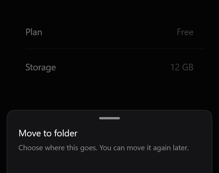
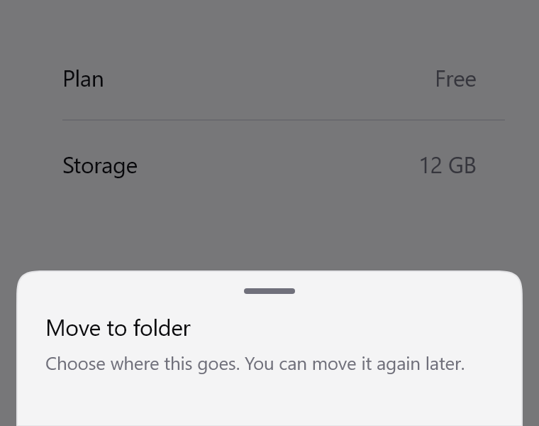
Parameters
Read out of LamintraSheet.kt when this page was built, not written by hand, so it cannot drift from the file the CLI installs. 3 required, 12 with defaults.
| Name | Type | Default |
|---|---|---|
visiblerequiredwhether the sheet is shown. This is a controlled component: it never dismisses itself, it calls onDismiss and waits | Boolean | - |
onDismissrequiredcalled on scrim tap, on a drag past the threshold, and on a downward fling. Set visible to false in response, or nothing happens | () -> Unit | - |
modifier | Modifier | Modifier |
colorssee LamintraSheetColors; defaults to following the system | LamintraSheetColors | LamintraSheetColors.auto() |
cornerRadiusthe top corners only. The bottom sits against the edge | Dp | 20.dp |
dismissFractionhow far down the card must be dragged, as a fraction of its own height, for release to dismiss. Proportional rather than a fixed distance so a tall sheet does not dismiss on a flick that would barely move a short one | Float | 0.35f |
flingVelocityrelease speed above which the sheet dismisses no matter how far it travelled, in dp per second | Dp | 400.dp |
upwardResistancehow much of an upward drag the card follows. 0f clamps it dead at the resting point; 1f lets it be dragged off the top | Float | 0.28f |
showHandlethe grab handle. Purely an affordance - the whole card is draggable either way | Boolean | true |
maxWidth | Dp | 640.dp |
horizontalPadding | Dp | 12.dp |
contentPadding | Dp | 20.dp |
hairlineWidth | Dp | 1.dp |
contentWindowInsetsinsets the CARD keeps clear of. The scrim ignores these on purpose. Pass WindowInsets(0) if a parent already consumed them | WindowInsets | WindowInsets.safeDrawing .only(WindowInsetsSides.Horizontal + WindowInsetsSides.Bottom) |
contentrequired | @Composable ColumnScope.() -> Unit | - |
What lands in your project
3 files, written under your own package. The internals are namespaced per component (internal/sheet/), which is what lets two components ship same-named helpers without colliding.
LamintraSheet.ktinternal/sheet/SheetShape.ktLamintraTheme.kt
Source
The whole file, verbatim. This is the component: there is nothing behind it, no artifact to depend on, and deleting Lamintra afterwards leaves it compiling.
Read LamintraSheet.kt
package com.lamintra.sheet

import androidx.compose.animation.AnimatedVisibility
import androidx.compose.animation.core.animate
import androidx.compose.animation.core.spring
import androidx.compose.animation.fadeIn
import androidx.compose.animation.fadeOut
import androidx.compose.animation.slideInVertically
import androidx.compose.animation.slideOutVertically
import androidx.compose.foundation.background
import androidx.compose.foundation.clickable
import androidx.compose.foundation.gestures.Orientation
import androidx.compose.foundation.gestures.draggable
import androidx.compose.foundation.gestures.rememberDraggableState
import androidx.compose.foundation.interaction.MutableInteractionSource
import androidx.compose.foundation.layout.Box
import androidx.compose.foundation.layout.Column
import androidx.compose.foundation.layout.ColumnScope
import androidx.compose.foundation.layout.WindowInsets
import androidx.compose.foundation.layout.WindowInsetsSides
import androidx.compose.foundation.layout.fillMaxSize
import androidx.compose.foundation.layout.fillMaxWidth
import androidx.compose.foundation.layout.offset
import androidx.compose.foundation.layout.only
import androidx.compose.foundation.layout.padding
import androidx.compose.foundation.layout.safeDrawing
import androidx.compose.foundation.layout.size
import androidx.compose.foundation.layout.widthIn
import androidx.compose.foundation.layout.windowInsetsPadding
import androidx.compose.runtime.Composable
import androidx.compose.runtime.LaunchedEffect
import androidx.compose.runtime.getValue
import androidx.compose.runtime.mutableFloatStateOf
import androidx.compose.runtime.remember
import androidx.compose.runtime.setValue
import androidx.compose.ui.Alignment
import androidx.compose.ui.Modifier
import androidx.compose.ui.draw.drawBehind
import androidx.compose.ui.graphics.Brush
import androidx.compose.ui.graphics.Color
import androidx.compose.ui.geometry.CornerRadius
import androidx.compose.ui.graphics.drawscope.Stroke
import androidx.compose.ui.layout.onSizeChanged
import androidx.compose.ui.platform.LocalDensity
import androidx.compose.ui.semantics.clearAndSetSemantics
import androidx.compose.ui.unit.Dp
import androidx.compose.ui.unit.IntOffset
import androidx.compose.ui.unit.dp
import androidx.compose.ui.zIndex
import com.lamintra.sheet.internal.sheet.SheetShape
import com.lamintra.theme.LamintraColors
import com.lamintra.theme.LamintraMotion
import com.lamintra.theme.LamintraTheme
import com.lamintra.theme.lamintraDarkColors
import com.lamintra.theme.lamintraLightColors
import kotlin.math.roundToInt

/**
 * Colours for [LamintraSheet].
 *
 * The three factory names - `dark()`, `light()`, `auto()` - are identical on
 * every Lamintra component on purpose. Do not rename them.
 */
data class LamintraSheetColors(
    val scrim: Color,
    val container: Color,
    val hairline: Color,
    /** The lit top edge. See [LamintraCardColors] for why this is not a shadow. */
    val highlight: Color,
    val handle: Color
) {
    companion object {
        /**
         * The scrim is [LamintraColors.shadow] at [scrimAlpha] rather than a
         * literal, and that is the only interesting decision here. `shadow` is
         * the one token whose value cannot be derived from any other: true
         * black on dark, near-black ink on light. A scrim mixed from `ink`
         * instead would go pale grey on a light theme and stop reading as
         * "behind glass" at all.
         */
        fun from(colors: LamintraColors, scrimAlpha: Float = 0.55f): LamintraSheetColors =
            LamintraSheetColors(
                scrim = colors.shadow.copy(alpha = scrimAlpha),
                // containerOverlay, not container. They were the same colour
                // until 2026-08-19, so a sheet over a card had nothing but the
                // scrim to separate them.
                container = colors.containerOverlay,
                hairline = colors.hairline,
                // Lighter than the hairline, because a sheet sits closer to the
                // reader than a card does and its top edge is the first thing
                // that arrives when it slides up.
                highlight = colors.ink.copy(alpha = 0.10f),
                handle = colors.inkFaint
            )

        fun dark(): LamintraSheetColors = from(lamintraDarkColors())

        fun light(): LamintraSheetColors = from(lamintraLightColors())

        /**
         * Follows the device's colour scheme. Reads the *device* setting, not
         * your app's theme - an app that forces its own scheme should pass
         * [dark] or [light] explicitly.
         */
        @Composable
        fun auto(): LamintraSheetColors = from(LamintraTheme.colors)
    }
}

/**
 * A bottom sheet: a scrim, a card anchored to the bottom edge, and a drag that
 * behaves.
 *
 * **Three things make this feel different from a sheet that animates on a
 * timer**, and all three are about carrying velocity rather than replaying a
 * curve:
 *
 * 1. **The settle is a spring seeded with the release velocity.** Let go
 *    mid-drag and the card continues at the speed your thumb left it at. A
 *    fixed-duration tween cannot do this: it restarts from zero every time, so
 *    a fast flick that does not quite reach the threshold visibly stalls before
 *    sliding back. That stall is most of what "cheap" feels like.
 * 2. **The scrim tracks the drag.** Pull the card down and the dim lifts in
 *    proportion, so the two are visibly one object rather than a card moving in
 *    front of an unrelated grey rectangle.
 * 3. **Dragging up resists instead of stopping dead.** Past the resting point
 *    the card follows at [upwardResistance] of your thumb. A hard clamp reads
 *    as the gesture having broken; resistance reads as the sheet being at the
 *    top of its travel, which is the truth.
 *
 * Dismissal is distance OR velocity, never distance alone: a short fast flick
 * is a dismissal and a long slow drag that stops short is not, and only
 * checking the distance gets both of those wrong.
 *
 * The scrim is full-bleed and the card is inset. Only the card is held clear of
 * the navigation bar, cutouts and the keyboard, so the dimming still covers the
 * system bars - which is what makes it read as covering the screen rather than
 * as a grey box drawn inside it.
 *
 * @param visible whether the sheet is shown. This is a controlled component:
 *        it never dismisses itself, it calls [onDismiss] and waits
 * @param onDismiss called on scrim tap, on a drag past the threshold, and on a
 *        downward fling. Set [visible] to false in response, or nothing happens
 * @param colors see [LamintraSheetColors]; defaults to following the system
 * @param cornerRadius the top corners only. The bottom sits against the edge
 * @param dismissFraction how far down the card must be dragged, as a fraction
 *        of its own height, for release to dismiss. Proportional rather than a
 *        fixed distance so a tall sheet does not dismiss on a flick that would
 *        barely move a short one
 * @param flingVelocity release speed above which the sheet dismisses no matter
 *        how far it travelled, in dp per second
 * @param upwardResistance how much of an upward drag the card follows. 0f
 *        clamps it dead at the resting point; 1f lets it be dragged off the top
 * @param showHandle the grab handle. Purely an affordance - the whole card is
 *        draggable either way
 * @param contentWindowInsets insets the CARD keeps clear of. The scrim ignores
 *        these on purpose. Pass `WindowInsets(0)` if a parent already consumed
 *        them
 */
@Composable
fun LamintraSheet(
    visible: Boolean,
    onDismiss: () -> Unit,
    modifier: Modifier = Modifier,
    colors: LamintraSheetColors = LamintraSheetColors.auto(),
    cornerRadius: Dp = 20.dp,
    dismissFraction: Float = 0.35f,
    flingVelocity: Dp = 400.dp,
    upwardResistance: Float = 0.28f,
    showHandle: Boolean = true,
    maxWidth: Dp = 640.dp,
    horizontalPadding: Dp = 12.dp,
    contentPadding: Dp = 20.dp,
    hairlineWidth: Dp = 1.dp,
    contentWindowInsets: WindowInsets = WindowInsets.safeDrawing
        .only(WindowInsetsSides.Horizontal + WindowInsetsSides.Bottom),
    content: @Composable ColumnScope.() -> Unit
) {
    // onDragStopped runs in a coroutine scope, not a density scope, so the
    // threshold is converted here where LocalDensity is in scope. Reading it
    // inside the callback does not compile.
    val flingVelocityPx = with(LocalDensity.current) { flingVelocity.toPx() }

    // Drag offset in px, 0 at rest, positive downward.
    var offsetY by remember { mutableFloatStateOf(0f) }
    // Measured on first layout. Until then dismissFraction has nothing to be a
    // fraction OF, so the distance test is skipped and velocity alone decides.
    var sheetHeightPx by remember { mutableFloatStateOf(0f) }

    // A reopened sheet must start at rest. Without this a sheet dismissed by
    // dragging reopens already pushed down by exactly the distance that
    // dismissed it, which looks like it failed to open.
    LaunchedEffect(visible) { if (visible) offsetY = 0f }

    val dragState = rememberDraggableState { delta ->
        val next = offsetY + delta
        offsetY = if (next < 0f) next * upwardResistance else next
    }

    // How far down the card is, 0..1, for the scrim to follow.
    val dragProgress = if (sheetHeightPx > 0f) {
        (offsetY / sheetHeightPx).coerceIn(0f, 1f)
    } else {
        0f
    }

    AnimatedVisibility(
        visible = visible,
        enter = fadeIn(animationSpec = LamintraMotion.fade()),
        exit = fadeOut(animationSpec = LamintraMotion.fade()),
        modifier = modifier.zIndex(10f)
    ) {
        Box(Modifier.fillMaxSize()) {
            Box(
                Modifier
                    .fillMaxSize()
                    // Fades as the card is pulled down. `1f - dragProgress`
                    // rather than a second animation: the scrim is following the
                    // finger, and anything with its own duration would lag
                    // behind the thing it is meant to belong to.
                    .background(colors.scrim.copy(alpha = colors.scrim.alpha * (1f - dragProgress)))
                    .clickable(
                        interactionSource = remember { MutableInteractionSource() },
                        indication = null,
                        onClick = onDismiss
                    )
            )

            AnimatedVisibility(
                visible = visible,
                enter = slideInVertically(animationSpec = LamintraMotion.travel()) { it },
                exit = slideOutVertically(animationSpec = LamintraMotion.travel()) { it },
                modifier = Modifier.align(Alignment.BottomCenter)
            ) {
                Column(
                    modifier = Modifier
                        .windowInsetsPadding(contentWindowInsets)
                        .padding(horizontal = horizontalPadding)
                        .widthIn(max = maxWidth)
                        .fillMaxWidth()
                        .onSizeChanged { sheetHeightPx = it.height.toFloat() }
                        .offset { IntOffset(0, offsetY.roundToInt()) }
                        .drawBehind {
                            val card = SheetShape.path(size.width, size.height, cornerRadius.toPx())
                            drawPath(card, colors.container)
                            // The uniform hairline stays: it is what separates
                            // the sheet from the scrim on every edge. The
                            // gradient on top of it is the light source, and
                            // the two do different jobs. See LamintraCard for
                            // the full reasoning; a black shadow does nothing
                            // on a near-black ground.
                            drawPath(card, colors.hairline, style = Stroke(hairlineWidth.toPx()))
                            drawPath(
                                card,
                                brush = Brush.verticalGradient(
                                    colors = listOf(colors.highlight, Color.Transparent),
                                    startY = 0f,
                                    endY = size.height * 0.45f
                                ),
                                style = Stroke(hairlineWidth.toPx())
                            )
                        }
                        .draggable(
                            state = dragState,
                            orientation = Orientation.Vertical,
                            onDragStopped = { velocity ->
                                val farEnough = sheetHeightPx > 0f &&
                                    offsetY > sheetHeightPx * dismissFraction
                                if (farEnough || velocity > flingVelocityPx) {
                                    onDismiss()
                                } else {
                                    // The spring is seeded with the release
                                    // velocity, which is the whole point: the
                                    // card carries on at the speed the thumb
                                    // left it at instead of restarting from
                                    // rest. Interrupting it mid-flight carries
                                    // that velocity too.
                                    animate(
                                        initialValue = offsetY,
                                        targetValue = 0f,
                                        initialVelocity = velocity,
                                        animationSpec = spring(
                                            dampingRatio = 0.82f,
                                            stiffness = 480f
                                        )
                                    ) { value, _ -> offsetY = value }
                                }
                            }
                        )
                        .padding(horizontal = contentPadding)
                        .padding(bottom = contentPadding)
                ) {
                    if (showHandle) {
                        DragHandle(
                            color = colors.handle,
                            modifier = Modifier.align(Alignment.CenterHorizontally)
                        )
                    }
                    content()
                }
            }
        }
    }
}

/**
 * The grab handle.
 *
 * 12dp of padding above and below a 4dp bar, so the whole block is 28dp and the
 * visible bar sits on the 4pt grid. It is marked as decorative: the card is
 * draggable regardless, so announcing a handle to a screen reader offers a
 * control that adds nothing over the sheet itself.
 */
@Composable
private fun DragHandle(
    color: Color,
    modifier: Modifier = Modifier,
    width: Dp = 36.dp,
    height: Dp = 4.dp
) {
    Box(
        modifier
            .padding(vertical = 12.dp)
            .size(width = width, height = height)
            .clearAndSetSemantics { }
            .drawBehind {
                // A plain capsule, NOT SheetShape: that rounds the top corners
                // only, which is right for a card sitting on the screen edge and
                // would leave this bar with two square corners underneath.
                drawRoundRect(
                    color = color,
                    cornerRadius = CornerRadius(size.height / 2f, size.height / 2f)
                )
            }
    )
}
Next
The command above assumes the project has been set up once already. If it has not, the install page covers what init detects and writes, and what to do when it guesses wrong.
The other components: swipe row, button, card, text field, list row, switch, segmented.