Segmented
One choice out of a few. The thumb slides between segments rather than cutting.
$ java -jar lamintra.jar add segmentedPreview
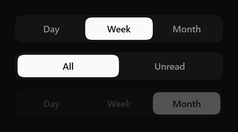
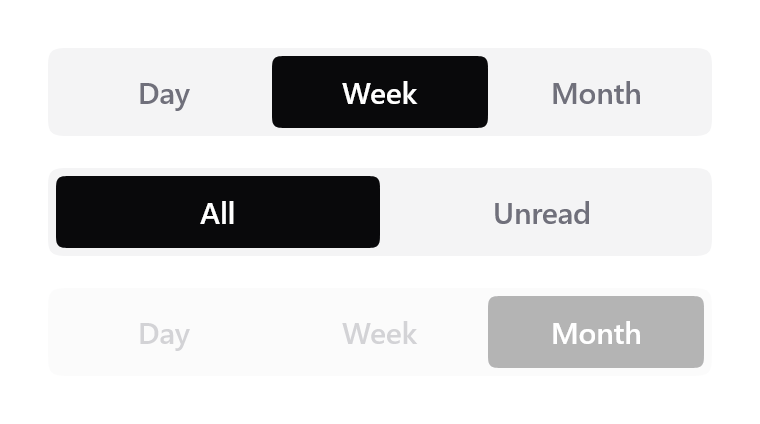
Rendered headlessly from LamintraSegmented.kt. Switch the scheme in the header and this changes with it: both are real renders of the same source rather than one filtered to look like the other.
Parameters
Read out of LamintraSegmented.kt when this page was built, not written by hand, so it cannot drift from the file the CLI installs. 3 required, 10 with defaults.
| Name | Type | Default |
|---|---|---|
optionsrequiredthe segment labels, in order. Sentence case; this component never transforms your content, because uppercase() here would corrupt every non-Latin script | List<String> | - |
selectedrequiredindex of the current choice. Out-of-range values are clamped rather than throwing, because this index usually comes from state a list edit can invalidate | Int | - |
onSelectrequiredcalled with the tapped index when enabled. This component is stateless: nothing moves until selected changes | (Int) -> Unit | - |
modifier | Modifier | Modifier |
enabledwhen false the control drops to disabledAlpha and ignores taps | Boolean | true |
colorssee LamintraSegmentedColors; defaults to following the system | LamintraSegmentedColors | LamintraSegmentedColors.auto() |
heightthe track height. 44dp is the touch-target floor and every segment inherits it | Dp | 44.dp |
contentPaddingthe gutter between the track edge and the thumb | Dp | 4.dp |
cornerRadiusnull means a capsule, which is the default silhouette. Pass a value for a tighter shape; the track picks up contentPadding on top of it so the two stay concentric | Dp? | null |
pressScalehow far the whole control shrinks while a segment is held. 1f disables it | Float | 0.985f |
disabledAlpha | Float | 0.3f |
focusRingWidth | Dp | 2.dp |
textStylelabel style. Never sets fontFamily, so the host app's typeface is used; replace it wholesale to restyle the labels | TextStyle | TextStyle( fontSize = 15.sp, lineHeight = 20.sp, fontWeight = FontWeight.Medium, letterSpacing = (-0.1).sp ) |
What lands in your project
3 files, written under your own package. The internals are namespaced per component (internal/segmented/), which is what lets two components ship same-named helpers without colliding.
LamintraSegmented.ktinternal/segmented/Squircle.ktLamintraTheme.kt
Source
The whole file, verbatim. This is the component: there is nothing behind it, no artifact to depend on, and deleting Lamintra afterwards leaves it compiling.
Read LamintraSegmented.kt
package com.lamintra.segmented

import androidx.compose.animation.core.animateFloatAsState
import androidx.compose.animation.core.spring
import androidx.compose.foundation.interaction.MutableInteractionSource
import androidx.compose.foundation.interaction.collectIsFocusedAsState
import androidx.compose.foundation.interaction.collectIsPressedAsState
import androidx.compose.foundation.layout.Box
import androidx.compose.foundation.layout.Row
import androidx.compose.foundation.layout.fillMaxHeight
import androidx.compose.foundation.layout.fillMaxSize
import androidx.compose.foundation.layout.fillMaxWidth
import androidx.compose.foundation.layout.height
import androidx.compose.foundation.layout.padding
import androidx.compose.foundation.selection.selectable
import androidx.compose.foundation.text.BasicText
import androidx.compose.runtime.Composable
import androidx.compose.runtime.getValue
import androidx.compose.runtime.remember
import androidx.compose.ui.Alignment
import androidx.compose.ui.Modifier
import androidx.compose.ui.draw.drawBehind
import androidx.compose.ui.graphics.Color
import androidx.compose.ui.graphics.drawscope.Stroke
import androidx.compose.ui.graphics.drawscope.translate
import androidx.compose.ui.graphics.graphicsLayer
import androidx.compose.ui.graphics.lerp
import androidx.compose.ui.semantics.Role
import androidx.compose.ui.text.TextStyle
import androidx.compose.ui.text.font.FontWeight
import androidx.compose.ui.unit.Dp
import androidx.compose.ui.unit.dp
import androidx.compose.ui.unit.sp
import com.lamintra.theme.LamintraColors
import com.lamintra.theme.LamintraTheme
import com.lamintra.theme.lamintraDarkColors
import com.lamintra.theme.lamintraLightColors
import com.lamintra.segmented.internal.segmented.Squircle
import kotlin.math.abs

/**
 * Colours for [LamintraSegmented].
 *
 * The three factory names - `dark()`, `light()`, `auto()` - are identical on
 * every Lamintra component on purpose. They are the migration seam: a future
 * shared token layer changes only what `auto()` reads, without touching a
 * single call site. Do not rename them.
 *
 * **The thumb is ink, not accent, and that is a deliberate reading of the
 * rule.** "Ink carries action, accent carries state" lists selection under
 * accent, which would argue for an accent thumb. It is ink here for three
 * reasons: the thumb is a filled surface a label sits on rather than a small
 * state marker, so it wants the same contrast pair the primary button uses;
 * ink survives grayscale at full strength where a mid accent collapses to the
 * track's own value; and a control that sits beside a primary button on the
 * same screen should agree with it about what "active" looks like. Pass
 * [thumb] and [labelSelected] to take the other reading - it is one argument.
 */
data class LamintraSegmentedColors(
    val track: Color,
    val thumb: Color,
    val label: Color,
    val labelSelected: Color,
    val focus: Color
) {
    companion object {
        /**
         * Maps the shared semantic layer onto this component's own slots.
         *
         * The thumb is `ink` and its label is `onInk`, which is the same pair a
         * filled button uses. That is deliberate: a selected segment IS a
         * filled action, and the two components should not disagree about what
         * that looks like.
         */
        fun from(colors: LamintraColors): LamintraSegmentedColors = LamintraSegmentedColors(
            track = colors.container,
            thumb = colors.ink,
            label = colors.inkMuted,
            labelSelected = colors.onInk,
            focus = colors.focus
        )

        fun dark(): LamintraSegmentedColors = from(lamintraDarkColors())

        fun light(): LamintraSegmentedColors = from(lamintraLightColors())

        /**
         * Follows the device's colour scheme. This is the default because when
         * it is wrong it is wrong *loudly* - a dark control on a light app is
         * glaring and takes one parameter to fix.
         *
         * Note it reads the *device* setting, not your app's theme. An app that
         * forces its own scheme should pass [dark] or [light] explicitly.
         */
        @Composable
        fun auto(): LamintraSegmentedColors = from(LamintraTheme.colors)
    }
}

/** The tightest step in the radius scale. The button uses the mid step. */
private val RADIUS_SM: Dp = 8.dp

/**
 * A segmented control: one choice out of a few, with a thumb that slides.
 *
 * **The slide is the component.** A thumb that cuts to the new segment is a
 * radio group wearing a pill; a thumb that travels there on a spring is the
 * thing that reads as expensive on iOS. Everything else here exists to keep
 * that motion honest.
 *
 * **Position carries selection and colour only reinforces it**, so the control
 * still reads correctly in a grayscale screenshot - the thumb is somewhere,
 * and where it is *is* the answer. Never invert that relationship.
 *
 * No gradients, no elevation planes, no blurred shadows, so it renders
 * identically on Android, iOS, desktop and wasm. `compose.foundation` only.
 *
 * Always fills the width it is given. To size it, constrain the [modifier]
 * (`Modifier.width(240.dp)`): the segments divide whatever width arrives, so
 * an unbounded one would collapse every segment to zero.
 *
 * @param options the segment labels, in order. Sentence case; this component
 *        never transforms your content, because `uppercase()` here would
 *        corrupt every non-Latin script
 * @param selected index of the current choice. Out-of-range values are clamped
 *        rather than throwing, because this index usually comes from state a
 *        list edit can invalidate
 * @param onSelect called with the tapped index when [enabled]. This component
 *        is stateless: nothing moves until [selected] changes
 * @param enabled when false the control drops to [disabledAlpha] and ignores taps
 * @param colors see [LamintraSegmentedColors]; defaults to following the system
 * @param height the track height. 44dp is the touch-target floor and every
 *        segment inherits it
 * @param contentPadding the gutter between the track edge and the thumb
 * @param cornerRadius `null` means a capsule, which is the default silhouette.
 *        Pass a value for a tighter shape; the track picks up
 *        [contentPadding] on top of it so the two stay concentric
 * @param pressScale how far the whole control shrinks while a segment is held.
 *        1f disables it
 * @param textStyle label style. Never sets `fontFamily`, so the host app's
 *        typeface is used; replace it wholesale to restyle the labels
 */
@Composable
fun LamintraSegmented(
    options: List<String>,
    selected: Int,
    onSelect: (Int) -> Unit,
    modifier: Modifier = Modifier,
    enabled: Boolean = true,
    colors: LamintraSegmentedColors = LamintraSegmentedColors.auto(),
    height: Dp = 44.dp,
    contentPadding: Dp = 4.dp,
    cornerRadius: Dp? = null,
    pressScale: Float = 0.985f,
    disabledAlpha: Float = 0.3f,
    focusRingWidth: Dp = 2.dp,
    textStyle: TextStyle = TextStyle(
        fontSize = 15.sp,
        lineHeight = 20.sp,
        fontWeight = FontWeight.Medium,
        letterSpacing = (-0.1).sp
    )
) {
    if (options.isEmpty()) return
    val count = options.size
    val current = selected.coerceIn(0, count - 1)

    // One source per segment: focus is per-segment because each segment is its
    // own focus target, and a ring that never moves while Tab does would be
    // worse than no ring.
    val sources = remember(count) { List(count) { MutableInteractionSource() } }
    var pressedAny = false
    var focusedIndex = -1
    sources.forEachIndexed { index, source ->
        val isPressed by source.collectIsPressedAsState()
        val isFocused by source.collectIsFocusedAsState()
        if (isPressed) pressedAny = true
        if (isFocused) focusedIndex = index
    }

    // The thumb's position is animated as a segment index rather than a Dp, so
    // there is no density round-trip between what is animated and what is
    // drawn, and an interruption mid-travel retargets from wherever it is.
    val position by animateFloatAsState(
        targetValue = current.toFloat(),
        animationSpec = spring(dampingRatio = 0.68f, stiffness = 700f)
    )
    // Brisk, barely bouncy - Apple's "bounce 0.15" band.
    val scale by animateFloatAsState(
        targetValue = if (pressedAny && enabled) pressScale else 1f,
        animationSpec = spring(dampingRatio = 0.72f, stiffness = 1400f)
    )

    Box(
        modifier = modifier
            .fillMaxWidth()
            .height(height)
            .graphicsLayer {
                scaleX = scale
                scaleY = scale
                alpha = if (enabled) 1f else disabledAlpha
            }
            // The thumb is sized from the draw scope's own width and the labels
            // from Row weights over that same width, so there is one grid. The
            // prototype computed a segment width in Dp for the thumb while the
            // labels came from weights, which is two sizing paths for one grid
            // and drifts by a rounding error at some widths.
            .drawBehind {
                val pad = contentPadding.toPx()
                val thumbHeight = (size.height - pad * 2f).coerceAtLeast(0f)
                val segmentWidth = ((size.width - pad * 2f) / count).coerceAtLeast(0f)
                // 8.dp, the tightest step in the scale, because a segmented
                // control is smaller than a button and a 12 would eat it. Was
                // thumbHeight/2, a capsule inside a capsule, which is the iOS
                // segmented silhouette and the Material one at once.
                val thumbRadius = cornerRadius?.toPx() ?: RADIUS_SM.toPx()
                // Concentric: a rounded rect inset by `pad` inside another needs
                // the outer radius to be the inner one plus that inset, or the
                // gutter pinches at the corners. One expression now rather than
                // two conditionals, so the relationship cannot drift.
                val trackRadius = thumbRadius + pad

                drawPath(Squircle.path(size.width, size.height, trackRadius), colors.track)

                if (focusedIndex >= 0 && enabled) {
                    // An INSET contour, unlike the detached ring on the button,
                    // field and switch. A segment is flush inside its track, so
                    // an outward ring would be clipped by it - the same reason
                    // the list row's ring is inset. The stroke is pulled in by
                    // half its width so it sits wholly within the segment.
                    val w = focusRingWidth.toPx()
                    val ring = Squircle.path(
                        (segmentWidth - w).coerceAtLeast(0f),
                        (thumbHeight - w).coerceAtLeast(0f),
                        thumbRadius
                    )
                    translate(
                        left = pad + segmentWidth * focusedIndex + w / 2f,
                        top = pad + w / 2f
                    ) {
                        drawPath(ring, colors.focus, style = Stroke(w))
                    }
                }

                val thumb = Squircle.path(segmentWidth, thumbHeight, thumbRadius)
                translate(left = pad + segmentWidth * position, top = pad) {
                    drawPath(thumb, colors.thumb)
                }
            }
    ) {
        Row(modifier = Modifier.fillMaxSize().padding(contentPadding)) {
            options.forEachIndexed { index, option ->
                // Tied to the thumb's actual position rather than run as a
                // second animation, so a label can never finish darkening
                // before the thumb has arrived under it.
                val t = (1f - abs(position - index)).coerceIn(0f, 1f)
                Box(
                    modifier = Modifier
                        .weight(1f)
                        .fillMaxHeight()
                        .selectable(
                            selected = index == current,
                            interactionSource = sources[index],
                            indication = null,
                            enabled = enabled,
                            role = Role.RadioButton,
                            onClick = { onSelect(index) }
                        ),
                    contentAlignment = Alignment.Center
                ) {
                    // Colour moves, weight never does. Animating weight would
                    // reflow the label's width as the thumb passed under it,
                    // and the whole row would jitter.
                    BasicText(
                        text = option,
                        style = textStyle.copy(
                            color = lerp(colors.label, colors.labelSelected, t)
                        )
                    )
                }
            }
        }
    }
}
Next
The command above assumes the project has been set up once already. If it has not, the install page covers what init detects and writes, and what to do when it guesses wrong.
The other components: swipe row, sheet, button, card, text field, list row, switch.