Button
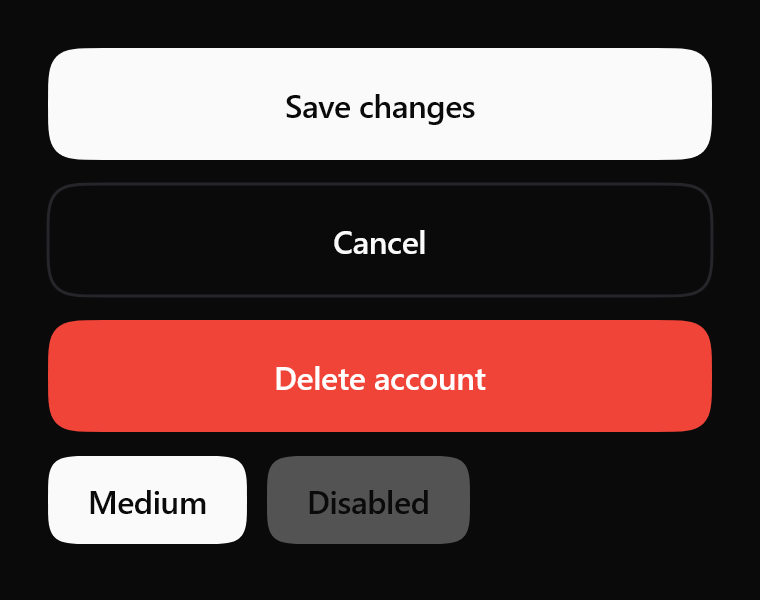
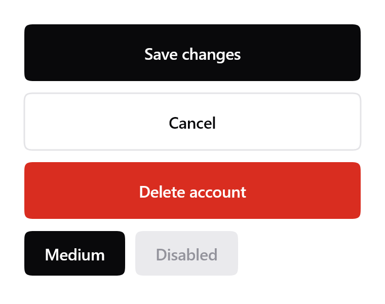
Four kinds and two sizes from one file. Emphasis is a parameter, not four components.
$ java -jar lamintra.jar add buttonPreview
Rendered headlessly from LamintraButton.kt. Switch the scheme in the header and this changes with it: both are real renders of the same source rather than one filtered to look like the other.
Parameters
Read out of LamintraButton.kt when this page was built, not written by hand, so it cannot drift from the file the CLI installs. 2 required, 14 with defaults.
| Name | Type | Default |
|---|---|---|
textrequiredthe label. Sentence case; this component never transforms your content, because uppercase() here would corrupt every non-Latin script and is the loudest dated tell in a UI besides | String | - |
onClickrequiredcalled on tap when enabled | () -> Unit | - |
modifier | Modifier | Modifier |
emphasisPrimary fills with ink, Destructive with the danger colour, Secondary draws a contour only, Ghost is text alone | ButtonEmphasis | ButtonEmphasis.Primary |
size | ButtonSize | ButtonSize.Large |
enabledwhen false the button becomes a recessed surface with dim text, dimmed further by disabledAlpha, and ignores taps | Boolean | true |
fillWidth | Boolean | true |
colorssee LamintraButtonColors; defaults to following the system | LamintraButtonColors | LamintraButtonColors.auto() |
cornerRadiusnull means the system radius, 12.dp. Pass a value for anything else, including height / 2 for a capsule | Dp? | null |
contentPadding | Dp | size.horizontalPadding |
pressScalehow far the control shrinks while held | Float | 0.97f |
disabledAlpha | Float | 0.75f |
borderWidth | Dp | 1.5.dp |
focusRingGap | Dp | 4.dp |
focusRingWidth | Dp | 2.dp |
textStylelabel style. Never sets fontFamily, so the host app's typeface is used; replace it wholesale to restyle the label | TextStyle | TextStyle( fontSize = 16.sp, lineHeight = 24.sp, fontWeight = FontWeight.SemiBold, letterSpacing = (-0.2).sp ) |
What lands in your project
3 files, written under your own package. The internals are namespaced per component (internal/button/), which is what lets two components ship same-named helpers without colliding.
LamintraButton.ktinternal/button/Squircle.ktLamintraTheme.kt
Source
The whole file, verbatim. This is the component: there is nothing behind it, no artifact to depend on, and deleting Lamintra afterwards leaves it compiling.
Read LamintraButton.kt
package com.lamintra.button

import androidx.compose.animation.core.animateFloatAsState
import androidx.compose.animation.core.spring
import androidx.compose.foundation.clickable
import androidx.compose.foundation.interaction.MutableInteractionSource
import androidx.compose.foundation.interaction.collectIsFocusedAsState
import androidx.compose.foundation.interaction.collectIsPressedAsState
import androidx.compose.foundation.layout.Box
import androidx.compose.foundation.layout.fillMaxWidth
import androidx.compose.foundation.layout.height
import androidx.compose.foundation.layout.padding
import androidx.compose.foundation.text.BasicText
import androidx.compose.runtime.Composable
import androidx.compose.runtime.getValue
import androidx.compose.runtime.remember
import androidx.compose.ui.Alignment
import androidx.compose.ui.Modifier
import androidx.compose.ui.draw.drawBehind
import androidx.compose.ui.graphics.Color
import androidx.compose.ui.graphics.drawscope.Stroke
import androidx.compose.ui.graphics.drawscope.translate
import androidx.compose.ui.graphics.graphicsLayer
import androidx.compose.ui.text.TextStyle
import androidx.compose.ui.text.font.FontWeight
import androidx.compose.ui.unit.Dp
import androidx.compose.ui.unit.dp
import androidx.compose.ui.unit.sp
import com.lamintra.theme.LamintraColors
import com.lamintra.theme.LamintraTheme
import com.lamintra.theme.lamintraDarkColors
import com.lamintra.theme.lamintraLightColors
import com.lamintra.button.internal.button.Squircle

/**
 * Emphasis is a parameter, not four separate components - install one file and
 * get all four. This mirrors how shadcn/ui treats `variant`, and it is why the
 * registry will never need a `primary-button` alongside this one.
 */
enum class ButtonEmphasis { Primary, Secondary, Ghost, Destructive }

/** Two sizes, both at or above the 44dp minimum touch target. */
enum class ButtonSize(val height: Dp, val horizontalPadding: Dp) {
    Large(56.dp, 28.dp),
    Medium(44.dp, 20.dp)
}

/**
 * The system corner radius, shared by every control-sized surface.
 *
 * Private to this file on purpose: components install independently, so a
 * shared constant would be a package this component cannot assume exists.
 * The value is the contract, not the symbol.
 */
private val RADIUS_MD: Dp = 12.dp

/**
 * Colours for [LamintraButton].
 *
 * The three factory names - `dark()`, `light()`, `auto()` - are identical on
 * every Lamintra component on purpose. They are the migration seam: a future
 * shared token layer changes only what `auto()` reads, without touching a
 * single call site. Do not rename them.
 *
 * **Ink carries action; accent carries state.** A button is an action, so a
 * primary button is solid ink rather than solid accent - which is also what
 * keeps it from competing with the components that do encode state.
 */
data class LamintraButtonColors(
    val ink: Color,
    val onInk: Color,
    val inkDim: Color,
    val hairline: Color,
    val danger: Color,
    val onDanger: Color,
    val focus: Color
) {
    companion object {
        /**
         * Maps the shared semantic layer onto this component's own slots.
         *
         * This is the whole of the third token tier: the names on the left
         * belong to a button, the names on the right belong to the system, and
         * this function is the only place the two vocabularies meet. Nothing
         * here invents a value.
         *
         * Note `inkDim` reads `inkMuted`. The slot names are NOT identical on
         * purpose: renaming a component's public field to match a token would
         * break every call site that passes it, for no gain.
         */
        fun from(colors: LamintraColors): LamintraButtonColors = LamintraButtonColors(
            ink = colors.ink,
            onInk = colors.onInk,
            inkDim = colors.inkMuted,
            hairline = colors.hairline,
            danger = colors.danger,
            onDanger = colors.onDanger,
            focus = colors.focus
        )

        /**
         * The dark scheme, forced.
         *
         * Values live in the theme now rather than here. Before 2026-08-11 this
         * function held seven literals and five of them also appeared in other
         * components, so a rebrand meant editing six files. Neither pure black
         * nor pure white appears anywhere in them: pure values vibrate on OLED
         * and read as an unstyled page rather than a designed one.
         */
        fun dark(): LamintraButtonColors = from(lamintraDarkColors())

        /** The light scheme, forced. */
        fun light(): LamintraButtonColors = from(lamintraLightColors())

        /**
         * Follows the theme if one is present, and the device otherwise.
         *
         * This is the default because when it is wrong it is wrong *loudly* -
         * a dark button on a light app is glaring and takes one parameter to
         * fix. Wrapping your app in [LamintraTheme] makes this follow your
         * palette; without it, it follows the device scheme as it always did.
         */
        @Composable
        fun auto(): LamintraButtonColors = from(LamintraTheme.colors)
    }
}

/**
 * A button.
 *
 * Flat solid fill, capsule silhouette, and a press that scales the whole
 * control down on a **spring** rather than a fixed-duration curve. That last
 * detail is not cosmetic: a spring carries velocity through an interruption and
 * a duration curve cannot, which is the whole of what "smooth" means in an iOS
 * or React Native app.
 *
 * No gradients, no elevation planes, no blurred shadows - so it renders
 * identically on Android, iOS, desktop and wasm. `compose.foundation` only.
 *
 * @param text the label. Sentence case; this component never transforms your
 *        content, because `uppercase()` here would corrupt every non-Latin
 *        script and is the loudest dated tell in a UI besides
 * @param onClick called on tap when [enabled]
 * @param emphasis Primary fills with ink, Destructive with the danger colour,
 *        Secondary draws a contour only, Ghost is text alone
 * @param enabled when false the button becomes a recessed surface with dim
 *   text, dimmed further by [disabledAlpha], and ignores taps
 * @param colors see [LamintraButtonColors]; defaults to following the system
 * @param cornerRadius `null` means the system radius, 12.dp. Pass a value for
 *        anything else, including `height / 2` for a capsule
 * @param pressScale how far the control shrinks while held
 * @param textStyle label style. Never sets `fontFamily`, so the host app's
 *        typeface is used; replace it wholesale to restyle the label
 */
@Composable
fun LamintraButton(
    text: String,
    onClick: () -> Unit,
    modifier: Modifier = Modifier,
    emphasis: ButtonEmphasis = ButtonEmphasis.Primary,
    size: ButtonSize = ButtonSize.Large,
    enabled: Boolean = true,
    fillWidth: Boolean = true,
    colors: LamintraButtonColors = LamintraButtonColors.auto(),
    cornerRadius: Dp? = null,
    contentPadding: Dp = size.horizontalPadding,
    pressScale: Float = 0.97f,
    disabledAlpha: Float = 0.75f,
    borderWidth: Dp = 1.5.dp,
    focusRingGap: Dp = 4.dp,
    focusRingWidth: Dp = 2.dp,
    textStyle: TextStyle = TextStyle(
        fontSize = 16.sp,
        lineHeight = 24.sp,
        fontWeight = FontWeight.SemiBold,
        letterSpacing = (-0.2).sp
    )
) {
    val interaction = remember { MutableInteractionSource() }
    val pressed by interaction.collectIsPressedAsState()
    val focused by interaction.collectIsFocusedAsState()

    // Brisk, barely bouncy - Apple's "bounce 0.15" band. The motion IS the
    // press feedback; nothing travels and nothing casts a shadow.
    val scale by animateFloatAsState(
        targetValue = if (pressed && enabled) pressScale else 1f,
        animationSpec = spring(dampingRatio = 0.72f, stiffness = 1400f)
    )

    // Disabled is a RECESSED SURFACE, not a faded one. Fading the whole layer
    // was the old behaviour and it failed the same way in both schemes: a white
    // Primary fill at 0.3 alpha over a near-black ground resolves to a mid-grey
    // pill, which reads as an ordinary enabled button rather than an inert one.
    // Recorded 2026-08-17 off the rendered specimen, where "Disabled" was the
    // most button-looking thing in the frame.
    val fill: Color? = when {
        !enabled -> colors.hairline
        emphasis == ButtonEmphasis.Primary -> colors.ink
        emphasis == ButtonEmphasis.Destructive -> colors.danger
        else -> null
    }
    val label = when {
        !enabled -> colors.inkDim
        emphasis == ButtonEmphasis.Primary -> colors.onInk
        emphasis == ButtonEmphasis.Destructive -> colors.onDanger
        emphasis == ButtonEmphasis.Secondary -> colors.ink
        else -> colors.inkDim
    }

    Box(
        modifier = modifier
            .then(if (fillWidth) Modifier.fillMaxWidth() else Modifier)
            .height(size.height)
            .graphicsLayer {
                scaleX = scale
                scaleY = scale
                alpha = if (enabled) 1f else disabledAlpha
            }
            .drawBehind {
                // 12.dp, not height/2. A capsule is Material 3's button
                // silhouette, and while this drew one no amount of colour work
                // was going to stop the component reading as Material - the
                // shape was the tell. It also made Squircle pointless: at
                // half-height radius a superellipse and a circular arc are the
                // same curve, so the one genuinely distinctive thing in this
                // file was invisible. At 12.dp the continuous corner is
                // visible, which is the whole point of drawing it.
                val radius = cornerRadius?.toPx() ?: RADIUS_MD.toPx()
                val path = Squircle.path(this.size.width, this.size.height, radius)

                if (focused && enabled) {
                    val pad = focusRingGap.toPx()
                    val ring = Squircle.path(
                        this.size.width + pad * 2,
                        this.size.height + pad * 2,
                        radius + pad
                    )
                    translate(left = -pad, top = -pad) {
                        drawPath(ring, colors.focus, style = Stroke(focusRingWidth.toPx()))
                    }
                }

                when {
                    fill != null -> drawPath(path, fill)
                    emphasis == ButtonEmphasis.Secondary ->
                        drawPath(path, colors.hairline, style = Stroke(borderWidth.toPx()))
                    else -> Unit
                }
            }
            .clickable(
                interactionSource = interaction,
                indication = null,
                enabled = enabled,
                onClick = onClick
            )
            .padding(horizontal = contentPadding),
        contentAlignment = Alignment.Center
    ) {
        BasicText(text = text, style = textStyle.copy(color = label))
    }
}
Next
The command above assumes the project has been set up once already. If it has not, the install page covers what init detects and writes, and what to do when it guesses wrong.
The other components: swipe row, sheet, card, text field, list row, switch, segmented.