Switch
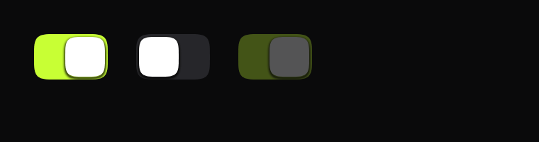
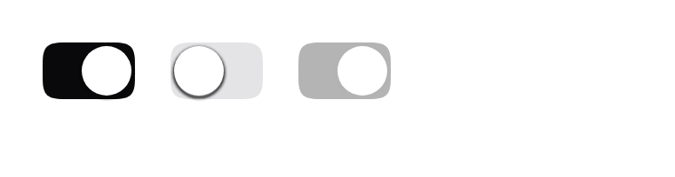
Knob position carries on and off, so it still reads in a greyscale screenshot.
$ java -jar lamintra.jar add switchPreview
Rendered headlessly from LamintraSwitch.kt. Switch the scheme in the header and this changes with it: both are real renders of the same source rather than one filtered to look like the other.
Parameters
Read out of LamintraSwitch.kt when this page was built, not written by hand, so it cannot drift from the file the CLI installs. 2 required, 14 with defaults.
| Name | Type | Default |
|---|---|---|
checkedrequiredcurrent state | Boolean | - |
onCheckedChangerequiredcalled with the new state on tap when enabled | (Boolean) -> Unit | - |
modifier | Modifier | Modifier |
enabledwhen false the switch drops to disabledAlpha and ignores taps | Boolean | true |
colorssee LamintraSwitchColors; defaults to following the system | LamintraSwitchColors | LamintraSwitchColors.auto() |
trackWidth | Dp | 52.dp |
trackHeight | Dp | 32.dp |
knobSize | Dp | 28.dp |
knobInset | Dp | 2.dp |
pressScale | Float | 0.94f |
disabledAlpha | Float | 0.3f |
shadowSpreadhow far the knob's shadow falls off. Set to 0.dp for a completely flat switch | Dp | 3.dp |
shadowDrop | Dp | 1.dp |
shadowAlpha | Float | 0.5f |
focusRingGap | Dp | 4.dp |
focusRingWidth | Dp | 2.dp |
What lands in your project
4 files, written under your own package. The internals are namespaced per component (internal/switch/), which is what lets two components ship same-named helpers without colliding.
LamintraSwitch.ktinternal/switch/Squircle.ktinternal/switch/SoftShadow.ktLamintraTheme.kt
Source
The whole file, verbatim. This is the component: there is nothing behind it, no artifact to depend on, and deleting Lamintra afterwards leaves it compiling.
Read LamintraSwitch.kt
package com.lamintra.switch

import androidx.compose.animation.core.Spring
import androidx.compose.animation.core.animateDpAsState
import androidx.compose.animation.core.animateFloatAsState
import androidx.compose.animation.core.spring
import androidx.compose.foundation.interaction.MutableInteractionSource
import androidx.compose.foundation.interaction.collectIsFocusedAsState
import androidx.compose.foundation.interaction.collectIsPressedAsState
import androidx.compose.foundation.layout.Box
import androidx.compose.foundation.layout.size
import androidx.compose.foundation.selection.toggleable
import androidx.compose.runtime.Composable
import androidx.compose.runtime.getValue
import androidx.compose.runtime.remember
import androidx.compose.ui.Modifier
import androidx.compose.ui.draw.drawBehind
import androidx.compose.ui.geometry.Rect
import androidx.compose.ui.graphics.Color
import androidx.compose.ui.graphics.Path
import androidx.compose.ui.graphics.drawscope.Stroke
import androidx.compose.ui.graphics.drawscope.translate
import androidx.compose.ui.graphics.graphicsLayer
import androidx.compose.ui.semantics.Role
import androidx.compose.ui.unit.Dp
import androidx.compose.ui.unit.dp
import com.lamintra.theme.LamintraColors
import com.lamintra.theme.LamintraPalette
import com.lamintra.theme.LamintraTheme
import com.lamintra.theme.lamintraDarkColors
import com.lamintra.theme.lamintraLightColors
import com.lamintra.switch.internal.switch.Squircle
import com.lamintra.switch.internal.switch.softShadow

/**
 * Colours for [LamintraSwitch].
 *
 * The three factory names - `dark()`, `light()`, `auto()` - are identical on
 * every Lamintra component on purpose. They are the migration seam: a future
 * shared token layer changes only what `auto()` reads, without touching a
 * single call site. Do not rename them.
 *
 * **[trackOn] is the one load-bearing colour in this library.** Everywhere else
 * colour is decoration over a form that already reads; here it encodes state.
 * Any host rebranding Lamintra should expect to change this first.
 */
data class LamintraSwitchColors(
    val trackOff: Color,
    val trackOn: Color,
    val knob: Color,
    val shadow: Color,
    val focus: Color
) {
    companion object {
        /**
         * Maps the shared semantic layer onto this component's own slots.
         *
         * `trackOn` is the accent, and it is the ONE load-bearing colour in the
         * whole library: everywhere else colour decorates a form that already
         * reads without it. It still passes the grayscale bar because knob
         * POSITION carries the state, not the hue.
         *
         * The knob is white in both schemes and is therefore not a token. It is
         * a component decision with its own measurement behind it: see the note
         * on the 1.18:1 contrast below.
         */
        fun from(colors: LamintraColors): LamintraSwitchColors = LamintraSwitchColors(
            trackOff = colors.hairline,
            trackOn = colors.accent,
            knob = LamintraPalette.White,
            shadow = colors.shadow,
            focus = colors.focus
        )

        /**
         * [accent] is the brand lime.
         *
         * **The white knob on this track measures 1.18:1, and that is accepted
         * deliberately.** Three treatments were rendered and compared rather
         * than argued. Inverting the knob to dark scores 16.78:1 and looks
         * wrong: a dark shape inside a bright field reads as a hole punched in
         * the track, not as a knob resting on it. What actually separates the
         * knob here is the soft shadow's edge, and the state itself is carried
         * by knob POSITION, so nothing is riding on that ratio.
         */
        fun dark(accent: Color = LamintraPalette.Neutral50): LamintraSwitchColors =
            from(lamintraDarkColors(accent = accent))

        /**
         * [accent] is a DARKENED lime, not the brand value, and the two schemes
         * disagree here on purpose. Full lime on a white page measures 1.18:1
         * against the surface BEHIND it, so the track would dissolve into the
         * page and the switch would read as permanently off - that one is a
         * real failure rather than an accepted one. This olive measures 5.57:1
         * against white and carries the white knob at the same 5.57:1.
         */
        fun light(accent: Color = LamintraPalette.Neutral950): LamintraSwitchColors =
            from(lamintraLightColors(accent = accent))

        /**
         * Follows the device's colour scheme. Reads the *device* setting, not
         * your app's theme - an app that forces its own scheme should pass
         * [dark] or [light] explicitly.
         */
        @Composable
        fun auto(): LamintraSwitchColors = from(LamintraTheme.colors)
    }
}

/**
 * A switch: a static track with a knob riding in it.
 *
 * **Position is the primary signal, colour is reinforcement.** The knob's
 * travel is what encodes on/off, which is why the component still reads
 * correctly in a grayscale screenshot where [LamintraSwitchColors.trackOn]
 * collapses to a mid-grey. Never invert that relationship in a new component -
 * a state carried by hue alone fails the bar.
 *
 * The knob moves on a **spring** with a little overshoot, and carries a real
 * soft shadow. Those two details are most of the difference between a switch
 * that feels expensive and one that feels like a toggle drawn in CSS.
 *
 * @param checked current state
 * @param onCheckedChange called with the new state on tap when [enabled]
 * @param enabled when false the switch drops to [disabledAlpha] and ignores taps
 * @param colors see [LamintraSwitchColors]; defaults to following the system
 * @param shadowSpread how far the knob's shadow falls off. Set to 0.dp for a
 *        completely flat switch
 */
@Composable
fun LamintraSwitch(
    checked: Boolean,
    onCheckedChange: (Boolean) -> Unit,
    modifier: Modifier = Modifier,
    enabled: Boolean = true,
    colors: LamintraSwitchColors = LamintraSwitchColors.auto(),
    trackWidth: Dp = 52.dp,
    trackHeight: Dp = 32.dp,
    knobSize: Dp = 28.dp,
    knobInset: Dp = 2.dp,
    pressScale: Float = 0.94f,
    disabledAlpha: Float = 0.3f,
    shadowSpread: Dp = 3.dp,
    shadowDrop: Dp = 1.dp,
    shadowAlpha: Float = 0.5f,
    focusRingGap: Dp = 4.dp,
    focusRingWidth: Dp = 2.dp
) {
    val interaction = remember { MutableInteractionSource() }
    val pressed by interaction.collectIsPressedAsState()
    val focused by interaction.collectIsFocusedAsState()

    val knobX by animateDpAsState(
        targetValue = if (checked) trackWidth - knobSize - knobInset else knobInset,
        animationSpec = spring(dampingRatio = 0.68f, stiffness = 700f)
    )
    // A bouncing opacity looks like a bug, so the track cross-fade gets no
    // overshoot even though the knob does.
    val on by animateFloatAsState(
        targetValue = if (checked) 1f else 0f,
        animationSpec = spring(dampingRatio = Spring.DampingRatioNoBouncy, stiffness = 700f)
    )
    val scale by animateFloatAsState(
        targetValue = if (pressed && enabled) pressScale else 1f,
        animationSpec = spring(dampingRatio = 0.72f, stiffness = 1400f)
    )

    Box(
        modifier = modifier
            .size(width = trackWidth, height = trackHeight)
            .graphicsLayer {
                scaleX = scale
                scaleY = scale
                alpha = if (enabled) 1f else disabledAlpha
            }
            .drawBehind {
                val track = Squircle.path(size.width, size.height, size.height / 2f)

                if (focused && enabled) {
                    val pad = focusRingGap.toPx()
                    val ring = Squircle.path(
                        size.width + pad * 2,
                        size.height + pad * 2,
                        (size.height + pad * 2) / 2f
                    )
                    translate(left = -pad, top = -pad) {
                        drawPath(ring, colors.focus, style = Stroke(focusRingWidth.toPx()))
                    }
                }

                drawPath(track, colors.trackOff)
                if (on > 0f) drawPath(track, colors.trackOn.copy(alpha = on))

                val k = knobSize.toPx()
                // A circle, not a squircle. Squircle at half-side radius gives a
                // superellipse, which rendered as a rounded square - and every
                // switch anyone has ever touched, physical or on either
                // platform, has a round knob. It is the one place in this
                // library where the continuous corner works against the shape
                // rather than for it. Seen only once all eight components sat
                // on one sheet together, 2026-08-17.
                val knob = Path().apply { addOval(Rect(0f, 0f, k, k)) }
                translate(left = knobX.toPx(), top = (size.height - k) / 2f) {
                    if (shadowSpread > 0.dp) {
                        softShadow(
                            path = knob,
                            color = colors.shadow,
                            spread = shadowSpread,
                            dropDown = shadowDrop,
                            maxAlpha = shadowAlpha
                        )
                    }
                    drawPath(knob, colors.knob)
                }
            }
            .toggleable(
                value = checked,
                interactionSource = interaction,
                indication = null,
                enabled = enabled,
                role = Role.Switch,
                onValueChange = onCheckedChange
            )
    )
}
Next
The command above assumes the project has been set up once already. If it has not, the install page covers what init detects and writes, and what to do when it guesses wrong.
The other components: swipe row, sheet, button, card, text field, list row, segmented.